
Most "pillar page examples" roundups are screenshots with captions: here's Brand X, isn't it pretty. That tells you nothing about why the page ranks or how to build your own version of it. This one is different. Every example below is broken down by structure pattern, the specific job that pattern does, and what you can lift from it even if your site has a fraction of the domain authority these brands do.
If you already know what a pillar page is and want the mechanics of building one, our topic clusters and pillar pages primer covers the definition and the cluster model. This article picks up from there: real pages, real patterns, real trade-offs.
What Makes a Pillar Page an Example Worth Copying
Not every long page is a pillar page, and not every pillar page is worth studying. The ones worth your time share three traits:
- A broad head topic, wide enough to organize five, ten, or fifty narrower articles underneath it (the "cluster").
- A structural device that makes 3,000+ words navigable: a sticky table of contents, jump links, a progress bar, or a visible outline at the top.
- Two-way internal linking: the pillar links out to cluster content, and cluster content links back up to the pillar. This is the part most examples get right visually and most beginners skip entirely when they copy the format.
Keep those three traits in mind as you go through the list. The visual polish is the least important part. The structural device and the linking pattern are what you can actually replicate on a smaller budget.
10 Pillar Page Examples, Broken Down by Pattern
| # | Example | Structure Pattern | Steal This For Your Own Page |
|---|---|---|---|
| 1 | Semrush's "What Is a Pillar Page" guide | Sticky left sidebar TOC with a scroll progress indicator | A visible progress bar cuts bounce on long pages by giving readers a sense of how much is left |
| 2 | Qualtrics brand-awareness pillar | Question-based H2s instead of noun-phrase headings | Framing sections as the exact question a reader typed matches search intent and often wins the featured snippet |
| 3 | Healthline's topic overview pages | Top-of-page "key takeaways" box, then a linked jump menu | A takeaways box lets skimmers get the gist in ten seconds and still stay on the page long enough to help dwell time |
| 4 | HubSpot's "Ultimate Guide" pillar format | Numbered section breakdown with a related-articles carousel at each section boundary | Placing cluster links inside the content, not just in a sidebar, gets more of them actually clicked |
| 5 | Microsoft's cloud-computing basics hub | Horizontal top navigation instead of a vertical sidebar | Works well when the pillar covers a handful of big sub-themes rather than dozens of narrow ones |
| 6 | 7Shifts' restaurant-costs guide | Step-by-step calculations and formulas embedded directly in the body | Turning an abstract topic into a worked calculation is a strong differentiator versus competitors who only explain concepts |
| 7 | Mailtrap's email-marketing beginner guide | Comprehensive sticky TOC plus embedded video and screenshots | Mixing media types (video, screenshot, table) inside one pillar keeps a 4,000-word page from feeling like a wall of text |
| 8 | ProfitWell's SaaS marketing site anatomy | Section-by-section teardown of a real product's site, used as the organizing device | Using one worked example as the spine of the whole pillar is easier to write and easier to follow than a generic overview |
| 9 | The Atlantic's "Population Healthier" hub | Editorial narrative structure with data visualizations between sections | Shows a pillar page does not have to be a listicle. A long-form narrative can be the pillar if the topic supports it |
| 10 | 3PL Central's state-of-the-industry report | Original survey data as the hook, cluster links woven into commentary on the data | Owning a piece of original data (even a small survey) is the single hardest thing for a competitor to copy |
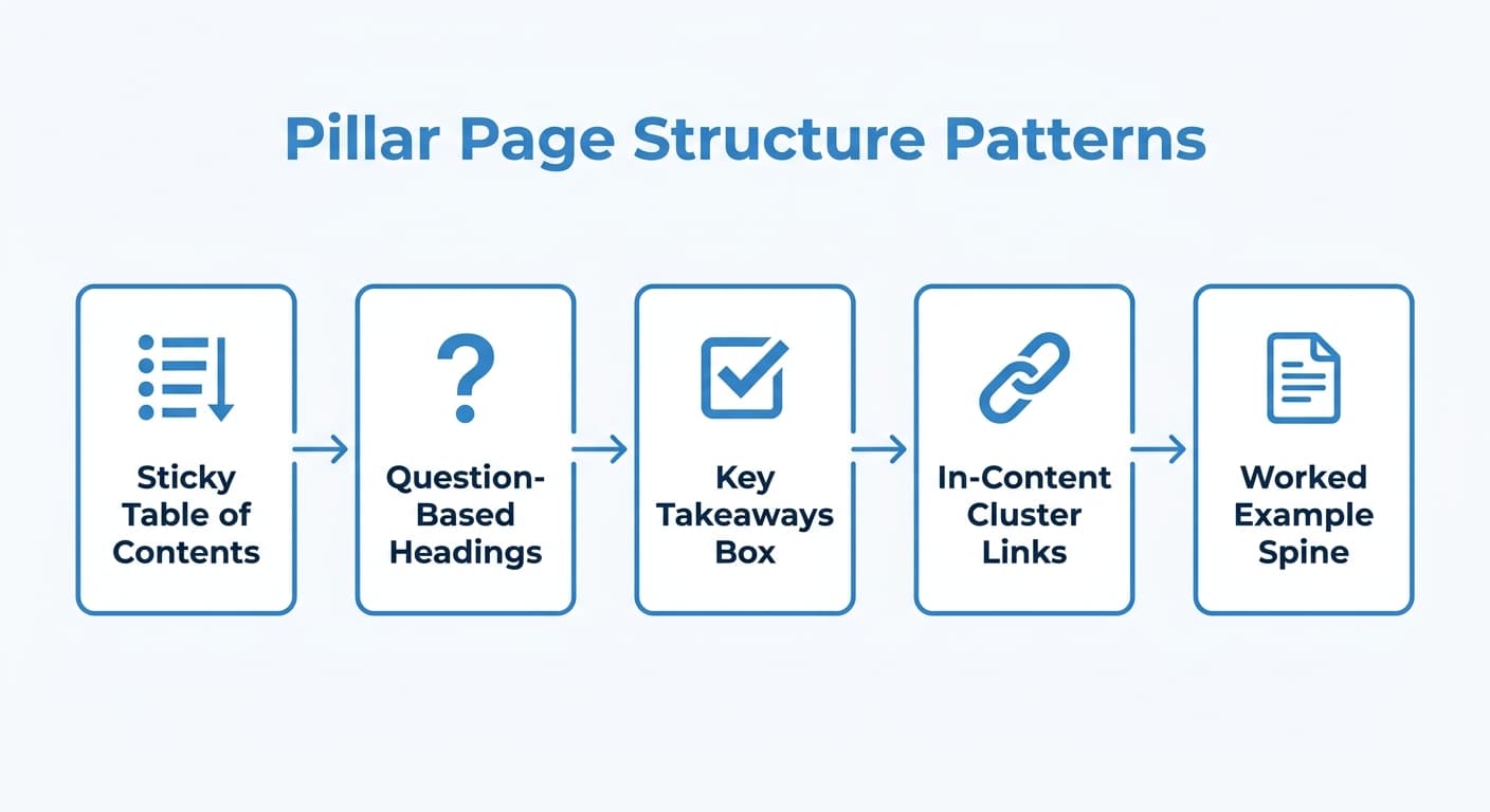
A few honest caveats on this list, because most roundups skip them. Not every example above is equally reproducible: The Atlantic and Microsoft's versions lean on brand authority and design budget most small teams do not have. The patterns worth copying first if you are starting from zero are Healthline's takeaways box, Qualtrics' question-based headings, and HubSpot's in-content cluster links, because none of them require a design team, just a content structure decision.
The Structural Device Matters More Than the Design
If you only take one thing from studying these examples, take this: the sticky table of contents, the progress bar, and the jump-link menu are not decoration. They exist because a 3,000 to 6,000 word page has a real risk of readers landing, seeing an intimidating wall of text, and leaving in the first ten seconds.
A few implementation notes practitioners tend to miss:
- Anchor links need actual descriptive text, not "Section 3." A jump link labeled "How to calculate food cost percentage" tells a scanning reader exactly what they will get if they click, which a numbered label does not.
- A sticky TOC needs a "currently reading" highlight state. Several sites in this list (Semrush, 7Shifts, Mailtrap) highlight the active section as the reader scrolls. Without it, the TOC is just a static list of links a reader glances at once and ignores.
- Mobile breaks this pattern by default. A sidebar TOC that works on desktop usually needs to collapse into a dropdown or an expandable "jump to section" button on mobile, or it eats half the screen. Test this specifically; it is the single most common thing that looks great on a laptop and terrible on a phone.
How Cluster Linking Actually Works in These Examples
The examples above only function as pillar pages because of what links into and out of them. A page covering a broad topic with no supporting cluster articles is just a long article, not a pillar.
The pattern across every example that does this well:
- The pillar page links out to each cluster article the first time that narrower subtopic is mentioned in the body, not bunched into a single "related reading" list at the bottom.
- Every cluster article links back to the pillar, usually in the intro, so a reader who lands on a narrow page can find the bigger picture immediately.
- The anchor text on both ends describes the destination topic, not "click here" or "read more."
This two-way structure is what search engines read as topical depth: one URL clearly organizes a set of others, and the others clearly belong to it. Get the linking pattern right and a mediocre design still works. Get the design right with no real cluster underneath it, and you have a long article with a table of contents, not a pillar page.
A pillar page without a real cluster underneath it is just a long article with a table of contents.
Common Mistakes When Copying a Pillar Page Format
Watching these examples has a failure mode: teams copy the visual shell and skip the substance underneath it.
- Building the pillar before the cluster exists. The pillar's job is to organize and link to cluster content. If you publish the pillar first with nothing to link to, you have to go back and retrofit links later, and most teams never do.
- Writing one page instead of designing a system. A pillar page is a hub with spokes. If the "cluster" is really just three thin articles you wrote to justify the pillar's existence, the whole cluster underperforms.
- Chasing the same head keyword the cluster articles target. The pillar should own the broad term; each cluster piece should own a specific, narrower variant. Overlap here creates keyword cannibalization instead of topical authority.
- Treating the TOC as optional polish. On a genuinely long page, skipping the navigation device is the single easiest way to inflate your bounce rate on exactly the page you spent the most effort writing.
- Forgetting to update the pillar when new cluster content ships. Several of the strongest examples above are visibly maintained pages, not "publish once and forget." A pillar that still links to five articles when the cluster has grown to twenty is quietly telling Google (and readers) that the page is stale.
Building Your Own Pillar and Cluster Without Guesswork
The hardest part of building a pillar page is rarely the writing. It is deciding, before you write a word, which narrower keywords actually belong under the pillar and which ones deserve their own separate page entirely. Get that grouping wrong and you either dilute the pillar with topics it should not own, or you split one topic across pages that end up competing with each other.
This is the part of the process that benefits from having your own site's ranking data in the loop rather than guessing from a spreadsheet. Murkuz pulls directly from your Search Console data to spot which of your existing pages are already competing for the same query (a sign they should be merged into one pillar-and-cluster structure instead of split), and which pages are sitting at positions 11 to 20 and are strong candidates to become the next spoke in a cluster you already have. Once you know the grouping, the harder question is not "what pillar page examples look nice" but "which cluster of my own pages is actually one topic wearing three different URLs."
FAQ
What is an example of a pillar page?
A well-known one is HubSpot's "Ultimate Guide" format, which organizes a broad topic (like productivity apps or Instagram marketing) into numbered sections, each linking out to a narrower supporting article. Semrush and Qualtrics use a similar model with a sticky table of contents instead of numbered sections. All three share the same underlying job: one broad page organizing a cluster of narrower ones.
What are pillar pages used for?
They organize a broad topic and its supporting subtopics into one structure search engines and readers can both navigate. The pillar page targets the broad, high-volume keyword; the cluster articles underneath it each target a narrower, specific variant. Done well, this signals topical authority and helps every page in the cluster rank a little better than it would standalone.
How do you create a pillar page?
Start from the cluster, not the pillar. List every narrow question or subtopic you already have (or plan to write) under a broad theme, group them, then write the pillar as the page that introduces the theme and links to each piece in the group. Building the pillar before the supporting cluster exists is the most common ordering mistake.
What is the difference between a pillar page and a landing page?
A pillar page is built to rank organically for a broad, informational keyword and to organize a cluster of related content underneath it. A landing page is usually built for a single campaign or conversion goal, often behind an ad, with a narrow call to action and no expectation of ranking for a wide range of terms. A pillar page can include a call to action, but its primary job is topical organization, not immediate conversion.
How long should a pillar page be?
Long enough to genuinely cover the breadth of the topic, which in practice for a competitive term is usually 2,500 to 5,000+ words. Length by itself is not the goal. The examples that work best use length to cover real breadth (multiple subtopics, each with its own section and its own cluster link), not to pad a narrow topic.
Junaid Khalid is the founder of Ertiqah and the builder of Murkuz. He has run SEO as the first growth channel across his own SaaS products, and built Murkuz around turning a site's own ranking data into the pillar-and-cluster decisions most teams still make by guesswork.