You built the dashboard. You connected Google Search Console, pulled in GA4, added a dozen widgets, sent the client a link. Three months later you check the analytics on that link and nobody has opened it since the kickoff call. This is not a design problem or a tool problem. It is a proof problem, and almost every guide to building an SEO dashboard skips straight past it to argue about which chart library to use.
An SEO reporting dashboard that clients actually read is not the one with the most metrics. It is the one that answers a single question every time someone opens it: did the work we did actually change anything? Everything else, every widget, every color, every "customizable" template, is in service of that one question or it is noise competing for the same fifteen seconds of attention.
This guide covers what to put on the dashboard, what to leave off, how to structure the report that wraps around it, and the specific reason most dashboards get built once and then die.
What an SEO Reporting Dashboard Actually Needs to Answer
Before picking metrics, get specific about who is looking and what they need to decide. A CMO glancing at a dashboard before a board meeting needs a different fifteen seconds than an SEO manager triaging which page to fix next. Most dashboard templates try to serve both audiences with the same wall of widgets, which is exactly why so many go unread: nobody's specific question gets answered fast, so everybody stops looking.
Three questions cover almost every stakeholder:
- Is visibility going up or down, and where? Rankings, impressions, and share of page-one keywords, broken out by page or topic, not just a single trend line for the whole site.
- Is that visibility turning into traffic and revenue? Organic sessions, conversions, and (where it applies) revenue, connected back to the pages that earned them.
- What did we do, and what happened because of it? The one section every dashboard in the current SERP results skips: a specific action tied to a specific outcome, not a chart that happens to be trending up around the same time you did some work.
That third question is the one that actually keeps a client opening the link. A chart going up answers "is it going well." It never answers "did what you did cause it," and clients who cannot answer that question for their boss eventually stop paying for whoever gave it to them.
The Metrics That Belong on the Dashboard (and the Ones That Don't)
Every major SEO dashboard template agrees on a similar core metric set, and they are right to: this part genuinely is table stakes.
Visibility metrics
- Organic keyword rankings, especially page-one and top-3 counts
- Search impressions and average position (from Google Search Console)
- Share of voice against named competitors, if you track it
Traffic metrics
- Organic sessions and users, with period-over-period comparison
- Landing page performance: which URLs are earning the traffic
- Branded vs. non-branded traffic split
Conversion and revenue metrics
- Goal completions or leads from organic
- Ecommerce revenue and transactions from organic sessions, where relevant
- Conversion rate by landing page
Technical health
- Site health score, crawl errors, and indexation issues
- Core Web Vitals, if the client's business is sensitive to page speed
The branded vs. non-branded split deserves a specific callout, because it is the difference between a dashboard that proves something and one that flatters a client with traffic they already owned. If a brand's organic traffic is 70 percent people searching the company name directly, a rising organic-sessions line mostly reflects brand awareness, not SEO work. Separate the two, every time, or the whole dashboard risks overstating what the SEO effort actually did.
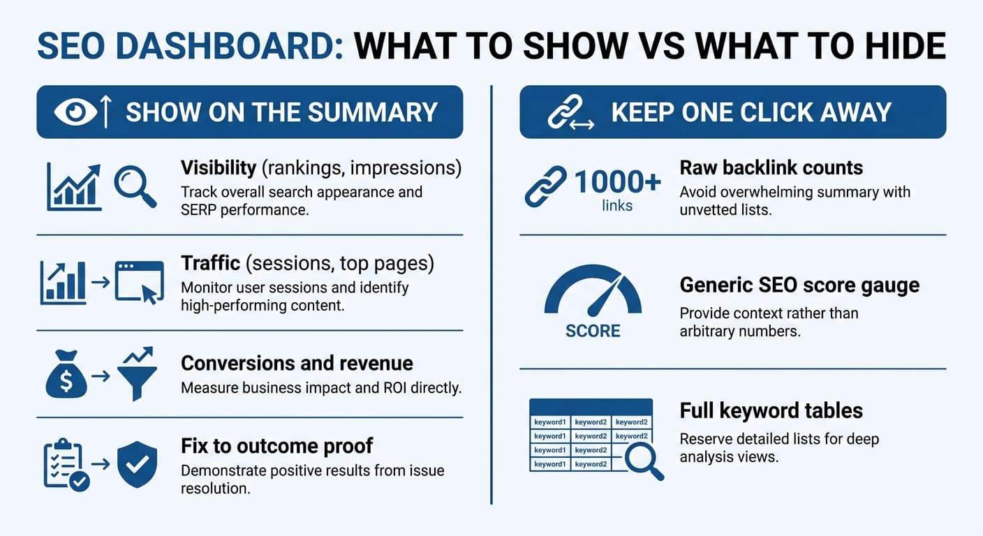
What does not belong on the main view, even though almost every tool ships it by default: raw backlink counts with no context, generic "SEO score" gauges that map to nothing a client can act on, and dense keyword-position tables with hundreds of rows. These are real data. They are also exactly the "too much, no hierarchy" failure mode that turns a dashboard into something people stop opening. Keep them one click away, in a detail tab, not on the summary view.
The Report Structure That Actually Gets Read
A dashboard is a live view. A report is what most clients actually open, usually monthly, often on a phone during a five-minute gap between meetings. Structure it the same way every time, in this order:
- The one-line verdict. Before any chart: "Organic traffic is up 12 percent this month, driven by the pricing page recovery we shipped in week 2." One sentence, plain language, no jargon. If you cannot write this sentence honestly, that is a signal about the month's work, not the report format.
- What changed and why. The specific fixes, refreshes, or new pages published this period, each tied to the metric it was meant to move.
- The numbers. Visibility, traffic, conversions, in that order, each with a period-over-period comparison, not just an absolute number sitting alone.
- What is next. The two or three things being worked on next period, so the report reads as a continuation, not a one-off snapshot.
Notice what is missing from that structure: a giant KPI wall at the top. Put the verdict first. A stakeholder who reads only the first sentence should still walk away knowing whether the last month was good or not, because most of them will only read the first sentence.
Why "Did the Fix Actually Work" Is the Hardest Part
Here is the part that separates a dashboard from a proof engine, and the part almost nothing written on this topic addresses directly. Showing that traffic went up is easy. Showing that a specific thing you did caused that traffic to go up is genuinely hard, because a hundred other things also changed that month: a competitor's page dropped, Google ran a core update, seasonality shifted, a different piece of content you published eight months ago finally caught momentum.
Correlation is what most dashboards default to, because it is what the data naturally gives you: a line going up, a fix that happened to land in the same window. Attribution, meaning tying that specific line movement to that specific fix with enough confidence to say it out loud in a client call, requires deliberately connecting the two:
- Log every fix with the exact date it went live and the exact page or keyword set it targeted.
- Pull the ranking and traffic trend for that specific page or keyword set, not the site-wide average, in the weeks immediately after.
- Compare it against a baseline: what that page was doing in the weeks before the fix, and ideally what similar untouched pages did over the same window, to rule out a site-wide or seasonal effect.
- Only then call it proven, and say so plainly: "this fix caused this recovery," not "traffic is trending up."
This is the exact gap that reporting-only tools cannot close on their own, because most of them are not the system that made the fix in the first place. They can show you a chart. They cannot tell you, with any real confidence, that fix caused that chart, because they never touched the page.
This is also where a closed-loop platform like Murkuz works differently: because it is the same system that detects the decaying page, generates the fix, and pushes it live, it can log the exact fix and the exact date automatically, then track the specific page afterward and produce what it calls an Agentic Impact Scorecard, a record that reads "content refresh on this page, plus eight positions, proven" rather than a chart that merely happens to point up. That is a narrower claim than most reporting tools make, and it is the one clients actually need answered.
Connecting Rankings to Real Business Outcomes
Google Search Console tells you rankings and impressions changed. It cannot tell you what a visitor did after they landed, which is exactly the gap Google Analytics 4 closes. A position moving from 3 to 8 is not just a ranking number; it is a specific, quantifiable shift in traffic, engagement, and, for ecommerce or SaaS sites, revenue. Layering GA4 data on top of GSC data turns "rankings improved" into "rankings improved, and here is what that was worth."
Concretely, that layering should let a dashboard answer three follow-up questions a client will eventually ask:
- Did the extra visibility bring real visitors, or just impressions? Compare clicks and sessions, not impressions alone; impressions can rise while actual traffic stays flat if the ranking gain lands on a low-intent query.
- Did those visitors behave differently? Bounce rate, time on page, and pages per session next to the ranking data show whether the traffic is engaged or just passing through.
- Did it turn into revenue or pipeline? For a page with a clear commercial intent, tie conversions and revenue directly to the specific URL, not to organic traffic as an undifferentiated whole.
A dashboard that only shows rankings can prove SEO activity happened. A dashboard that connects rankings to GA4 data can prove SEO activity mattered, which is the actual question every client is really asking, whether or not they phrase it that way.
Tools for Building the Dashboard
The mechanics of assembling a dashboard are genuinely solved territory, and there is no reason to build one from scratch:
- Looker Studio (free) connects directly to Search Console and GA4 and is the most common starting point for teams building their own view without a subscription.
- Dedicated SEO platforms with built-in dashboards (SE Ranking, Whatagraph, AgencyAnalytics, and similar) add rank tracking, white-labeling, and multi-client management on top of the raw GA4/GSC connection, which matters most for agencies reporting to several clients at once.
- A closed-loop platform that both makes the fixes and reports on them removes a manual step entirely: instead of exporting data from one tool into a dashboard built in another, the same system that detected the issue and shipped the fix also produces the proof, with the fix-to-outcome link already established rather than reconstructed after the fact by a human comparing two dashboards by hand.
Which category fits depends on whether the bottleneck is building the view (Looker Studio solves that for free) or connecting specific work to specific results (which requires the system doing the reporting to also be the system that did the work).
A Simple Worked Example
A mid-sized SaaS site has a pricing page that slid from position 4 to position 11 over four months, a classic content decay pattern. The team refreshes the page: updated screenshots, an expanded FAQ section, a couple of stale statistics replaced. Two weeks later the page recovers to position 6.
A dashboard built the "chart only" way shows this as: organic traffic for the site is up 9 percent this month. True, but it buries the actual story and gives a skeptical stakeholder nothing to hold onto if they ask "why."
A dashboard built the "prove it" way shows: pricing page, refreshed March 14, position 11 to 6 in two weeks, organic sessions on that URL up 40 percent, trial signups attributed to that page up correspondingly. Same underlying event. One version is a data point. The other is a story a non-technical stakeholder can repeat back to their own boss in one sentence, which is the actual test of whether a report did its job.
FAQ
What should be on an SEO reporting dashboard?
At minimum: organic visibility (rankings, impressions, position), organic traffic (sessions, users, top landing pages), conversions or revenue attributable to organic, and a clear link between specific work done and the specific metric it was meant to move. Technical health (crawl errors, site health score) belongs one click deeper, not on the main summary view.
How often should an SEO report be sent to clients?
Monthly is the standard cadence for most SEO retainers, since ranking and traffic changes need at least a few weeks to separate signal from noise. Agencies managing fast-moving campaigns or larger budgets sometimes add a lighter biweekly check-in, but a report sent more often than the data can meaningfully change usually just adds noise.
What is the difference between an SEO dashboard and an SEO report?
A dashboard is a live, always-current view, typically shared as a link a client can check anytime. A report is a point-in-time summary, usually monthly, that leads with a written verdict and the key numbers rather than requiring the reader to interpret raw charts themselves. Most teams need both: a dashboard for anyone who wants to check in real time, and a report for the recurring, structured update.
How do I prove SEO is working to a client?
Tie a specific action (a page refresh, a new page published, a technical fix) to a specific, measurable outcome on the specific page or keyword set it targeted, in the weeks immediately following the change, compared against that page's own baseline. A site-wide traffic chart alone cannot separate your work from a core update, a competitor's misstep, or ordinary seasonality; a page-level, dated, before-and-after comparison can.
Which metrics prove SEO ROI?
Organic conversions and revenue attributed to specific pages are the closest thing to a direct ROI metric. Rankings and traffic are necessary supporting evidence, but on their own they only show activity, not business value; connecting them to GA4 conversion and revenue data is what turns a ranking chart into an ROI number a CMO can defend in a budget conversation.
Junaid Khalid is the founder of Ertiqah and the builder of Murkuz. He has run SEO as the first growth channel across his own SaaS products, and spent enough hours building dashboards nobody opened to eventually build a tool where the reporting and the fix are the same system.